 Download
 Fork on Github
Demo
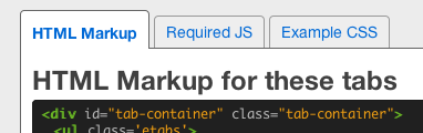
HTML Markup for these tabs
<div id="tab-container" class="tab-container">
  <ul class='etabs'>
    <li class='tab'><a href="#tabs1-html">HTML Markup</a></li>
    <li class='tab'><a href="#tabs1-js">Required JS</a></li>
    <li class='tab'><a href="#tabs1-css">Example CSS</a></li>
  </ul>
  <div id="tabs1-html">
    <h2>HTML Markup for these tabs</h2>
    <!-- content -->
  </div>
  <div id="tabs1-js">
    <h2>JS for these tabs</h2>
    <!-- content -->
  </div>
  <div id="tabs1-css">
    <h2>CSS Styles for these tabs</h2>
    <!-- content -->
  </div>
</div>
The HTML markup for your tabs and content can be arranged however you want. At the minimum, you need a container, a collection of links for your tabs (an unordered list by default), and matching divs for your tabbed content. Make sure the tab href attributes match the
id of the target panel (panels must be referenced by id, not class). This is standard semantic markup for in-page anchors.
The class names above are just to make it easy to style. You can make them whatever you want, there's no magic here.
JS for these tabs
<script src="/javascripts/jquery.js" type="text/javascript"></script>
<script src="/javascripts/jquery.hashchange.js" type="text/javascript"></script>
<script src="/javascripts/jquery.easytabs.js" type="text/javascript"></script>
Optionally include the jquery hashchange plugin (recommended) or address plugin to enable forward- and back-button functionality.
$('#tab-container').easytabs();CSS Styles for these tabs
.etabs { margin: 0; padding: 0; }
.tab { display: inline-block; zoom:1; *display:inline; background: #eee; border: solid 1px #999; border-bottom: none; -moz-border-radius: 4px 4px 0 0; -webkit-border-radius: 4px 4px 0 0; }
.tab a { font-size: 14px; line-height: 2em; display: block; padding: 0 10px; outline: none; }
.tab a:hover { text-decoration: underline; }
.tab.active { background: #fff; padding-top: 6px; position: relative; top: 1px; border-color: #666; }
.tab a.active { font-weight: bold; }
.tab-container .panel-container { background: #fff; border: solid #666 1px; padding: 10px; -moz-border-radius: 0 4px 4px 4px; -webkit-border-radius: 0 4px 4px 4px; }
View More Demos, including use with Twitter Bootstrap and jQuery UI Themeroller themes.

Browser Compatibility

- Internet Explorer 7+
- Firefox 4+
- Chrome
- Safari
- Opera 11
Why EasyTabs?
So, why use this instead of jQuery UI tabs? Besides the fact, that jQuery UI includes a bunch of other stuff, jQuery UI says your tabs should look like this:
But sometimes you want your tabs to look like this:
Or this:
Or this:
Or this:
You get the picture. EasyTabs leaves the styling up to you, and doesn't mangle your HTML markup. It handles the functionality while staying out of your way.
Why you should use EasyTabs (in bullets):
- Lightweight: the minified version is only 8KB - vs 20KB for only the jQueryUI core + tabs widget
- Provides smooth transitions between panels when tab is selected
- Allows complete customization of appearance, layout, and style via CSS
- Supports back-button and forward-button in browsers
- Tabs are bookmarkable and SEO-friendly
- Loads AJAX content, or anything not already on the page
- Tabs can automatically cycle at a specified interval
- Adds NO global JS variables
- Can have multiple EasyTabs instances on one page
- Written in jQuery plugin format, chain-able with other jQuery commands
- Completely valid HTML markup
- Open-source and dual licensed under the MIT and GPL licenses
- Does not style your tabs in any way (either through javascript or CSS), making it easier to customize
NOTE: Easytabs works with jQuery 1.4.3 and greater, but only the latest minor version of jQuery is actively supported (1.10 at this time).
Required Markup
The only rules you need to follow are these:
- a container
<div> - the container contains a collection (a
<ul>by default) of links<a> - the container also contains panel divs (for the tabbed content), each div has a unique id that matches the href property of a link in the tab collection
Other than that, go nuts. The order of the elements does NOT matter. Your tabs could be before or after the panels. You can put non-tabbed content between the elements. You could even put the tabs inside one of the panels! It doesn't matter.
Styling Tabs and Content
To style your tabs, you simply use your own CSS and stylesheet. Here's some very basic styling to get you started:
EasyTabs will simply add the active class to the currently selected tab and panel. Also, any element inside of the currently-selected tab also gets the .active class. So, for example, your tab markup would look like this:
<ul>
  <li class="active">
    <a href="#tab-1" class="active">Tab 1</a>
  </li><li>
  </li><li>
    <a href="#tab-2">Tab 2</a>
  </li>
</ul>
... if the first tab was active, where the class="active" is the only
markup added by EasyTabs.
AJAX Tabs
Sometimes we want to load content into a tab from another page via AJAX. In order to do that, we'll change the markup of the tabs a little bit.
Also see the cache configuration option, and the easytabs:ajax:beforeSend and easytabs:ajax:complete event hooks below.
Configuration
You can configure EasyTabs by passing in a hash of options when you instantiate it on a container. The following is a list of all the available options, including accepted and default values.
Available Options
| Option | Description | Values (default) |
|---|---|---|
| animate | Makes content panels fade out and in when a new tab is clicked. | true, false ( true) |
| animationSpeed | Controls the speed of the fading effect if animate: true. |
"slow", "normal", "fast", integer in milliseconds ( "normal") |
| cache v2.3 |
Caches the content retrieved for ajax tabs after the first request, such that subsequent tab clicks only hide/show the content. | true, false ( true) |
| collapsedByDefault v2.1 |
Makes tabs collapsed by default (when the page is loaded) if collapsible: true. Note that if defaultTab is specified, then collapsedByDefault defaults to false. |
true, false ( true) |
| collapsedClass v2.1 |
Adds specified class to tab when panel is collapsed. Only works for collapsible: true. |
any class name string ( "collapsed") |
| collapsible v2.1 |
Makes panels collapse and un-collapse if active tab is clicked repeatedly. | true, false ( false) |
| containerClass v2.3.4 |
Adds class(es) to the container on instantiation. | String of desired CSS classes separated by spaces ( "") |
| cycle v1.1.2 |
Turns on automatic cycling through tabs, with the specified cycling interval in milliseconds. | false, integer in milliseconds ( false) |
| defaultTab | Selects the <li> tab to activate when page first loads. |
any single jquery selector e.g. "li:first-child" or "li#tab-2" ( "li:first-child") |
| panelActiveClass | Adds specified class to the currently-selected content <div> |
any class name string e.g. "active" or "selected" ( "active") |
| panelClass v2.3.4 |
Adds class(es) to each panel element on instantiation. | String of desired CSS classes separated by spaces ( "") |
| panelContext v3.1.1 |
Context in which to search for panels matching tabs. | jQuery object ( $container - i.e. tab container
on which easytabs was called) |
| tabActiveClass | Adds specified class to the currently-selected tab <li> (and it's descendants). |
any class name string e.g. "active" or "selected" ( "active") |
| tabsClass v2.3.4 |
Adds class(es) to the tab container on instantiation. | String of desired CSS classes separated by spaces ( "") |
| tabClass v2.3.4 |
Adds class(es) to each tab on instantiation. | String of desired CSS classes separated by spaces ( "") |
| tabs v1.1.2 |
The container element for your tabs, relative to the container element that easyTabs was applied to. | any jquery selector referencing your collection of tabs e.g. "ul#tabs > li" or "div#tab-container > span" ( "> ul > li", which selects the top-level |
| transitionIn v2.2 |
The jQuery effect used to show the target panel when a tab is selected. | 'fadeIn', 'slideDown' ( 'fadeIn') |
| transitionInEasing v3.1 |
The jQuery easing speed for the transitionIn animation. May also be used with custom easing plugins, such as provided by the jquery easing plugin |
'swing', 'linear' ( 'swing') |
| transitionOut v2.2 |
The jQuery effect used to hide the visible panel when a tab is selected. | 'fadeOut', 'slideUp' ( 'fadeOut') |
| transitionOutEasing v3.1 |
The jQuery easing speed for the transitionOut animation. May also be used with custom easing plugins, such as provided by the jquery easing plugin |
'swing', 'linear' ( 'swing') |
| transitionCollapse v2.2 |
The jQuery effect used to collapse the panel if collapsible: true. |
'fadeOut', 'slideUp', 'hide' ( slideUp) |
| transitionCollapseEasing v3.1 |
The jQuery easing speed for the transitionCollapse animation. May also be used with custom easing plugins, such as provided by the jquery easing plugin |
'swing', 'linear' ( 'swing') |
| transitionUncollapse v2.2 |
The jQuery effect used to un-collapse the panel if collapsible: true. |
'fadeIn', 'slideDown', 'show' ( slideDown) |
| transitionUncollapseEasing v3.1 |
The jQuery easing speed for the transitionUncollapse animation. May also be used with custom easing plugins, such as provided by the jquery easing plugin |
'swing', 'linear' ( 'swing') |
| updateHash v1.1.2 |
Tells easyTabs whether or not to update the browser window's URL hash, useful for SEO and bookmarking. | true, false ( true) |
| uiTabs v2.1 |
Automatically uses class names and defaults of jQuery UI tabs, making it easy to switch from jQuery-UI tabs without needing to change any HTML or CSS styles. | true, false ( false) |
Advanced Demo
Here's an example that uses some of the non-default configuration options:
HTML Markup for these tabs
<div id="tab-full-container" class='tab-container'>
 <div class='etabs'>
  <span class='tab'><a href="#tabs2-html">HTML Markup</a></span>
  <span class='tab' id="tab-2"><a href="#tabs2-js">The JS</a></span>
 </div>
 <div class='panel-container'>
  <div id="tabs2-html">
   <h2>HTML Markup for these tabs</h2>
   <!-- content -->
  </div>
   <div id="tabs2-js">
   <h2>JS for these tabs</h2>
   <!-- content -->
  </div>
 </div>
</div>
JS for these tabs
$("#tab-full-container").easytabs({
  animate: true,
  animationSpeed: 1000,
  defaultTab: "span#tab-2",
  panelActiveClass: "active-content-div",
  tabActiveClass: "selected-tab",
  tabs: "> div > span",
  updateHash: false,
  cycle: 2000
});
Event Hooks
jQuery EasyTabs fires off three events to which you can bind your own functionality.
| Option | Description | Parameters |
|---|---|---|
| easytabs:before | Fires before a tab is selected. The tab-selection is canceled if
your handler to this event returns false. |
[event, $clicked, $targetPanel, settings] |
| easytabs:midTransition | Fires after the previous panel has been hidden, but before the next is shown. | [event, $clicked, $targetPanel, settings] |
| easytabs:after | Fires after a tab has been selected (and after the panel is completely finished transitioning in). | [event, $clicked, $targetPanel, settings] |
| For ajax tabs, there are two additional event hooks that fire: | ||
| easytabs:ajax:beforeSend | Fires before ajax request is made. | [event, $clicked, $targetPanel] |
| easytabs:ajax:complete | Fires when ajax request is complete (before the content is loaded). | [event, $clicked, $targetPanel, response, status, xhr] |
You can bind custom handlers to any of these events. You can even cancel the tab change by returning false in an easytabs:before binding.
Here are the events being fired from the cycling tabs in the Advanced Demo above. Click to stop
The above logging is being done with this JS:
var log = true;

$('#stop-logging').click( function() {
  log = false;
});

$('#tab-full-container')
  .bind('easytabs:before', function() {
    if ( log ) {
      var $tabConsole = $('#tab-console'),
          $lastGroup = $tabConsole.find('.logged-event-group').slideUp();

      $tabConsole
        .append("<div class='logged-event-group'><span class='logged-event'>easytabs:before fired</span></div>");
      setTimeout( function() { $lastGroup.remove(); }, 500);
    }
  })
  .bind('easytabs:midTransition', function() {
    if ( log ) {
      $('#tab-console')
        .find('.logged-event-group').last()
          .append("<span class='logged-event'>easytabs:midTransition fired</span>");
    }
  })
  .bind('easytabs:after', function() {
    if ( log ) {
      $('#tab-console')
        .find('.logged-event-group').last()
          .append("<span class='logged-event'>easytabs:after fired</span>");
    }
  });
All callbacks also pass parameters to the handler function, as described in this post.
The ajax event hooks have their own set of data passed as well, see this post for more detail and examples.
The easytabs:midTransition is also when the URL gets updated if updateHash is true (which it is by default). The URL must be updated precisely after the previous panel has disappeared from the page, but before the next panel appears to avoid making the browser window jump to the top of the panel when the URL is updated.
Public methods
EasyTabs currently has one public method, called select, which allows you to select a tab via JavaScript. Click this button to select the third tab in the Nested tabs demo below.
$('#select-button').click( function() {
  $('#outer-container').easytabs('select', '#nested-tab-3');
});
The parameter passed to select ('#tab-2' in the example above), can be either a jQuery selector to select the tab (e.g. one of the <li> elements), the tab link (e.g. one of the <a> elements), or it can be the id of one of the panels.
More demos
Here are some more demos showcasing what you can do with EasyTabs. Check out the source and the linked tabs.css to see how they're done.
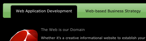
Twitter Bootstrap
Works out of the box with Twitter Bootstrap markup and styles.
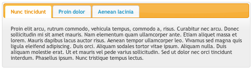
Lorem Ipsum
Lorem Ipsum
Lorem Ipsum
Lorem Ipsum
jQueryUI Themeroller
EasyTabs can be used with your existing jQuery UI themeroller theme.
Replace $('#tabs').tabs(); with
$('#tabs').easytabs({uiTabs: true}); and you're all set.
Morbi tincidunt, dui sit amet facilisis feugiat, odio metus gravida ante, ut pharetra massa metus id nunc. Duis scelerisque molestie turpis. Sed fringilla, massa eget luctus malesuada, metus eros molestie lectus, ut tempus eros massa ut dolor. Aenean aliquet fringilla sem. Suspendisse sed ligula in ligula suscipit aliquam. Praesent in eros vestibulum mi adipiscing adipiscing. Morbi facilisis. Curabitur ornare consequat nunc. Aenean vel metus. Ut posuere viverra nulla. Aliquam erat volutpat. Pellentesque convallis. Maecenas feugiat, tellus pellentesque pretium posuere, felis lorem euismod felis, eu ornare leo nisi vel felis. Mauris consectetur tortor et purus.
Mauris eleifend est et turpis. Duis id erat. Suspendisse potenti. Aliquam vulputate, pede vel vehicula accumsan, mi neque rutrum erat, eu congue orci lorem eget lorem. Vestibulum non ante. Class aptent taciti sociosqu ad litora torquent per conubia nostra, per inceptos himenaeos. Fusce sodales. Quisque eu urna vel enim commodo pellentesque. Praesent eu risus hendrerit ligula tempus pretium. Curabitur lorem enim, pretium nec, feugiat nec, luctus a, lacus.
Duis cursus. Maecenas ligula eros, blandit nec, pharetra at, semper at, magna. Nullam ac lacus. Nulla facilisi. Praesent viverra justo vitae neque. Praesent blandit adipiscing velit. Suspendisse potenti. Donec mattis, pede vel pharetra blandit, magna ligula faucibus eros, id euismod lacus dolor eget odio. Nam scelerisque. Donec non libero sed nulla mattis commodo. Ut sagittis. Donec nisi lectus, feugiat porttitor, tempor ac, tempor vitae, pede. Aenean vehicula velit eu tellus interdum rutrum. Maecenas commodo. Pellentesque nec elit. Fusce in lacus. Vivamus a libero vitae lectus hendrerit hendrerit.
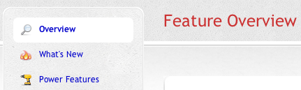
Nested tabs
Tabs on side
Configurations
This example has the animation disabled, so tab-switching is instantaneous. It also sets the active class names to custom names for more control over CSS stylization.
Heading 2
Stuff from the second tab.
Heading 3
More stuff from the last tab.
Tabs on bottom
Heading 1
This is the content of the first tab.
Configuration
This example displays the second tab by default. Also, the tab-switching animation is slowed down to 4 seconds (2sec fade-out and 2sec fade-in).
Heading 3
More stuff from the last tab.
Collapsible and cancelable
Heading 1
This is the content of the first tab.
Heading 2
Stuff from the second tab.
Heading 3
More stuff from the last tab.
Transition Options
Custom Transitions and Easing
This example uses slideUp and slideDown to transition between tab changes.
And fadeOut and fadeIn are used for collapsing the tabs (it doesn't look as good as the default behavior, just showing you can do what you want, we won't judge).
This example also custom easing options with the jquery easing plugin.
Heading 2
Wasn't that cool? Yeah.
Heading 3
Awesome.
Disconnected tabs and panels
Here is some random information that is not contained in the tabbed content and situated between the tabs and content divs.
Discontiguous Panels
Your panels don't have to be contiguous with your tabs, they can be elsewhere in the tab container.
But that's not even the half of it. Your panels can also be
somewhere else in the DOM entirely (outside of your tab container), if
you specify an alternate panelContext.
The panelContext is any jQuery DOM element, in which
easytabs will look for the panels. By default, it's the container
on which easytabs() was called.
Click "Awesome tab" above and scroll to the top.
Second Tab
Nothing to see here, folks. Move along.